new UP Fighting Maroons logo’s retrogressive design
the UP Fighting Maroons, University Of The Philippines’ senior basketball team in the UAAP recently announced a new logo.
when i saw it, i fell off my chair.
LOOK: UP Fighting Maroons unveil new logo in time for UAAP S78
Read more: http://sports.inquirer.net/184521/look-up-fighting-maroons-unveil-new-logo-in-time-for-uaap-s78#ixzz3dTMQd64p
Follow us: @inquirerdotnet on Twitter | inquirerdotnet on Facebook
UP as a university is known for it’s fine arts and design (and architecture) graduates. if you are into fine arts or design, UP is the school for you to go to. it is popular for these courses. in other words UP is known for good taste.
but not this new logo of the UP Fighting Maroons – it is ugly. and yes, i call the design “retrogressive”.
we are guessing this is how the design process went and how it was sold to the UP officials.
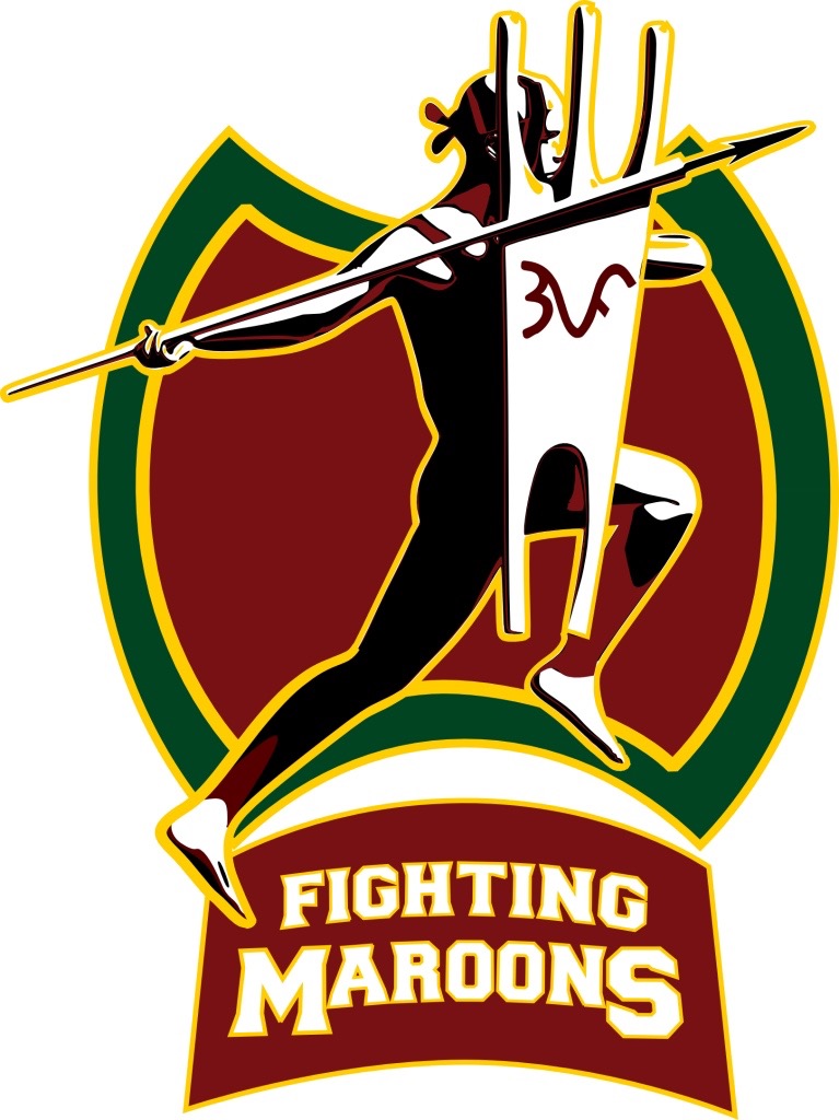
the old logo they had was the image of the oblation. and we suppose the direction for the new logo was to have something more active and aggressive, to be more in keeping with the idea behind a “fighting maroon”. the old logo was not “fighting”, it was just standing, not to mention it is naked except for the fig leaf. the last one though is a digression.
the new logo is supposed to embody the “fighting” spirit – a native warrior holding a spear and a long shield. the spear is the “fighting” part but we think the long shield and the stance of the native can be argued as really more of defensive rather than offensive. it is not really as aggressive as you want it to be.
the added plus is that the man with the spear and shield is the most basic component of basketball – offense and defense. the spear is the offense and the shield the defense. it’s logical and it’s also cute. but for us being cute does not count much.
the other part of the logo that we really do not understand is the giant maroon shield with green lining behind the native. what is that for? a warrior with a spear and a shield in front of a giant shield? really? we think the logo would have worked anyway if they removed the giant shield behind the native and let the native just stand on the “fighting maroon” text. we even think the logo would be nicer and more manly without the giant shield behind the native. it will also give better focus on the native, which is the major change in the logo.
this can be minor, but why is the warrior wearing a bandana on his head? we do not see that in the oblation. we think this was an unnecessary component of the design.
the main changes in the new UP fighting maroon logo are : a maroon colored warrior in a “fighting” (or defensive) stance with a spear and a shield.
that leads us to the UE Red Warriors logo. oh yes, UE calls itself “warriors”. although we are very sure when the new UP logo was presented, the presenters were very careful not to use the term “warrior” but used “native” instead. never mind that the UP “native” is also wearing a bandana just like the UE warrior is. and let’s not even mention the color red of UE is very close to the maroon of UP.
the actual images may be different – UE has just a head of the warrior while UP has the full body of the native but we think they are just too close for comfort. the new UP logo is like he full version of the UE logo which is just an abbreviation. it’s like if the UE warrior was shown with a full body, it will look like the UP native with or without the spear and shield.
![]()
the logo is the main identity of what they represent. it is best to be unique, to be unlike any other. that is the most basic. the other basic component of a logo is its meaning or meanings. the new UP logo is an obvious attempt to fill it up with meanings but it has forgotten the other component of uniqueness. we think the logo being too close to the UE Red Warriors is its biggest sin.
aside from those, the design elements do not make sense. the design appears to have been some kind of high school project where shapes and symmetry were put without a view for good aesthetics.
one key component of a new design is it is supposed to be better than the old one. this one does not do that. it looks bad versus the old one, a retrogression.
bring back the oblation, please.
this is a WAWAM!
where in the world…


Most Recent Readers Comments